
Part 3 彈出視窗 (Modal) 主題顏色選擇與記事對話方塊
加入對話方塊/彈出視窗 (Modal)
課堂講解影音
先將css整理至檔案
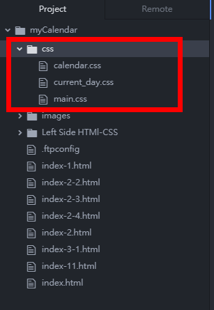 加入3個css檔案的參考:
<title>myCalendar</title>
<link rel="icon" href="images/icon1.png" type="image/png" sizes="72x72"/>
<link rel="stylesheet" href="css/main.css">
<link rel="stylesheet" href="css/current_day.css">
<link rel="stylesheet" href="css/calendar.css">
<style media="screen">
</style>
注意:記得檢查這些檔案是否有上傳到主機。(upload或sync) 目前階段的程式連結
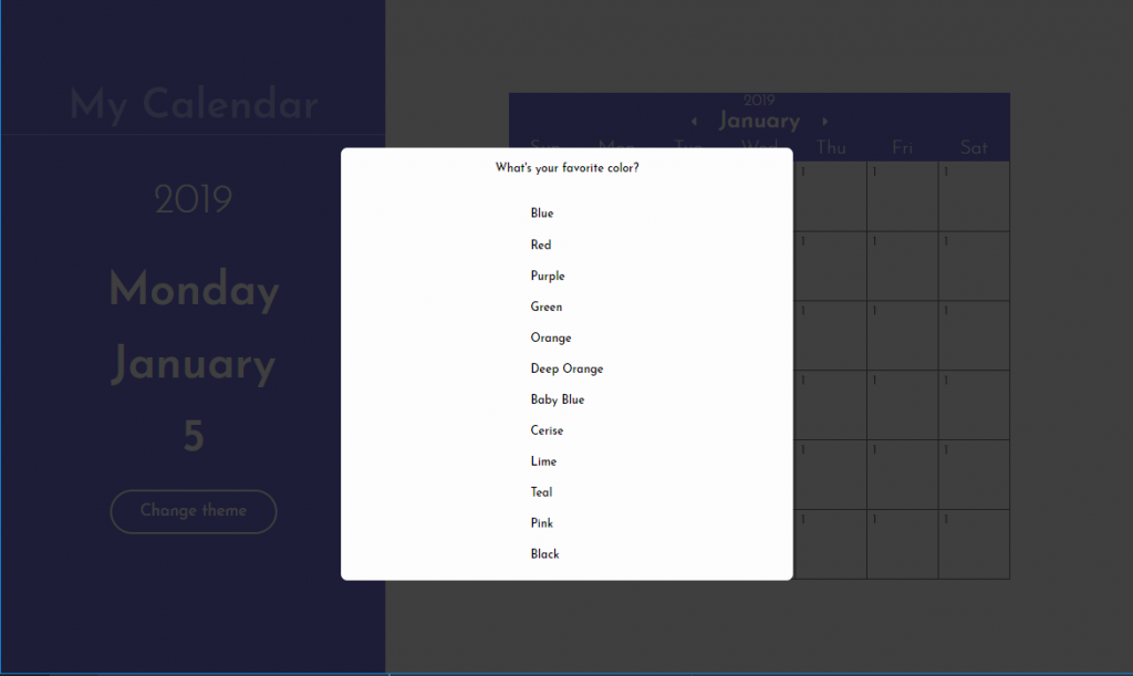
加入一個簡單的對話方塊(dialog)
<dialog id="modal" open></dialog>將下列css加入main.css中,此格式會將整個網頁100%覆蓋,並且製作一個非純黑色/灰色(29,29,20)且透明度85%的類玻璃紙效果的遮蓋,使得浮出的對話框可以更被強調。
dialog {
  height: 100%;
  width: 100%;
  border: none;
  padding: 0;
  background-color: rgba(29, 29, 29, 0.85);
  position: fixed;
}
目前階段的程式連結
 註:可將dialog的open去除,觀察其變化。
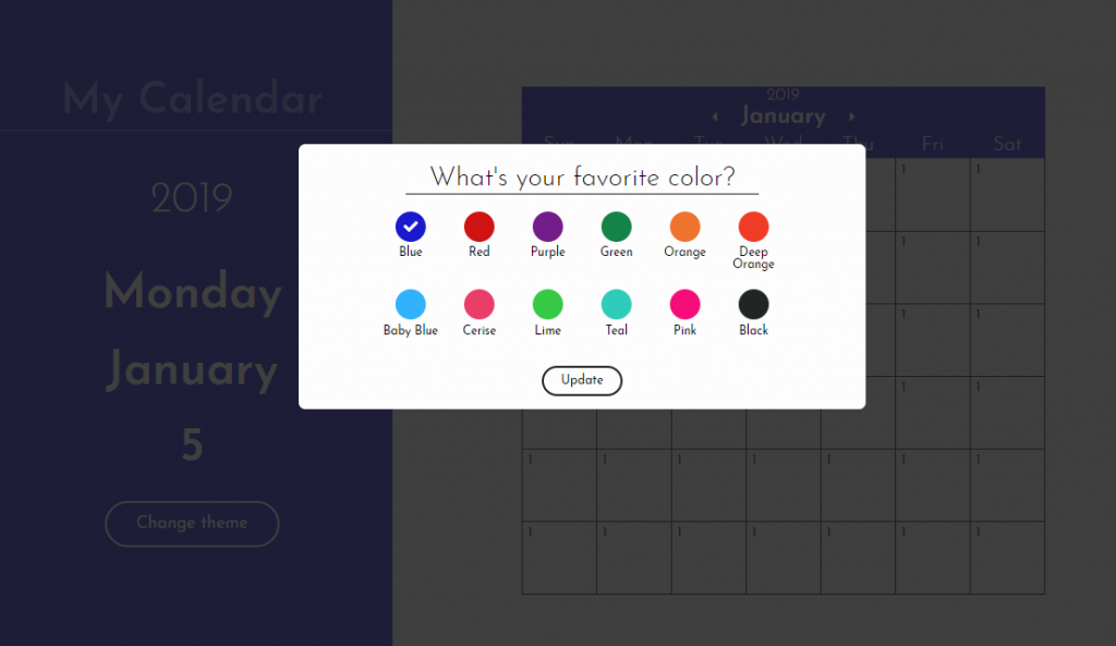
加入顏色選擇對話方塊的html碼
顏色選擇對話方塊的結構如下: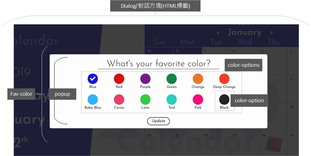
<dialog id="modal" open>
   <div id="fav-color" open>
     <div class="popup">
       <h4 class="center">What's your favorite color?</h4>
       <div id="color-options">
         <div class="color-option">
           <div class="color-preview" id="blue" style="background-color: #1B19CD;"></div>
           <h5>Blue</h5>
         </div>

         <div class="color-option">
           <div class="color-preview" id="red" style="background-color: #D01212;"></div>
           <h5>Red</h5>
         </div>

         <div class="color-option">
           <div class="color-preview" id="purple" style="background-color: #721D89;"></div>
           <h5>Purple</h5>
         </div>

         <div class="color-option">
           <div class="color-preview" id="green" style="background-color: #158348;"></div>
           <h5>Green</h5>
         </div>

         <div class="color-option">
           <div class="color-preview" id="orange" style="background-color: #EE742D;"></div>
           <h5>Orange</h5>
         </div>

         <div class="color-option">
           <div class="color-preview" id="deep-orange" style="background-color: #F13C26;"></div>
           <h5>Deep Orange</h5>
         </div>

         <div class="color-option">
           <div class="color-preview" id="baby-blue" style="background-color: #31B2FC;"></div>
           <h5>Baby Blue</h5>
         </div>

         <div class="color-option">
           <div class="color-preview" id="cerise" style="background-color: #EA3D69;"></div>
           <h5>Cerise</h5>
         </div>

         <div class="color-option">
           <div class="color-preview" id="lime" style="background-color: #36C945;"></div>
           <h5>Lime</h5>
         </div>

         <div class="color-option">
           <div class="color-preview" id="teal" style="background-color: #2FCCB9;"></div>
           <h5>Teal</h5>
         </div>

         <div class="color-option">
           <div class="color-preview" id="pink" style="background-color: #F50D7A;"></div>
           <h5>Pink</h5>
         </div>

         <div class="color-option">
           <div class="color-preview" id="black" style="background-color: #212524;"></div>
           <h5>Black</h5>
         </div>
       </div>
     </div>
   </div>
</dialog>
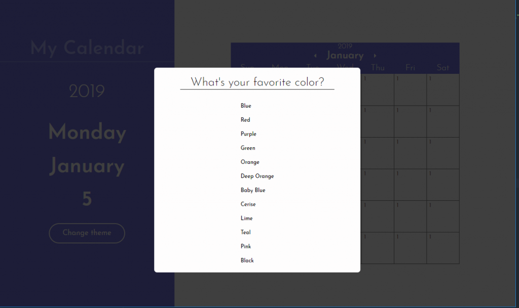
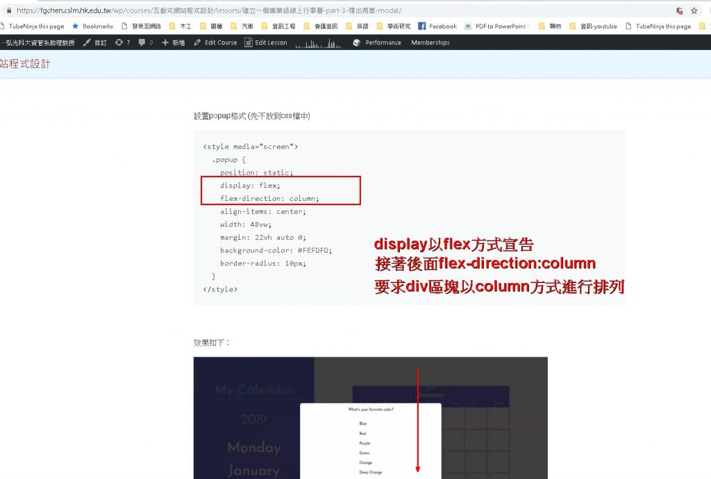
設置popup格式 (先不放到css檔中)
.popup {
    position: absolute;
    display: flex;
    flex-direction: column;
    align-items: center;
    width: 50vw;
    margin: 0 auto;
    background-color: #FEFDFD;
    border-radius: 10px;
    top: 50%;
    left: 50%;
    transform: translate(-50%, -50%);
  }
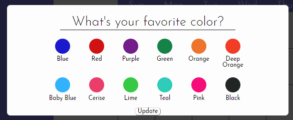
效果如下:
 註:要讓popup可以在螢幕保持在中間的位置,我們試著做以下的css設置,大家可以試試:
.popup {
  position: absolute;
  display: flex;
  flex-direction: column;
  align-items: center;
  width: 60vw;
  margin: 0;
  top: 50%;
  left: 50%;
  transform: translate(-50%, -50%);
  background-color: #FEFDFD;
  border-radius: 10px;
}
目前階段的程式連結
顏色選擇對話方塊的格式設置 – 標題列 h4 元素的格式設定
加入css格式:<style media="screen">
#fav-color h4 {
margin: 32px 0 18px;
font-size: calc(12px + 1.6vw);
font-weight: 300;
padding: 0 2vw 2px;
border-bottom: 1px solid #222;
}
</style>
標題列變化如下:
 目前階段的程式連結
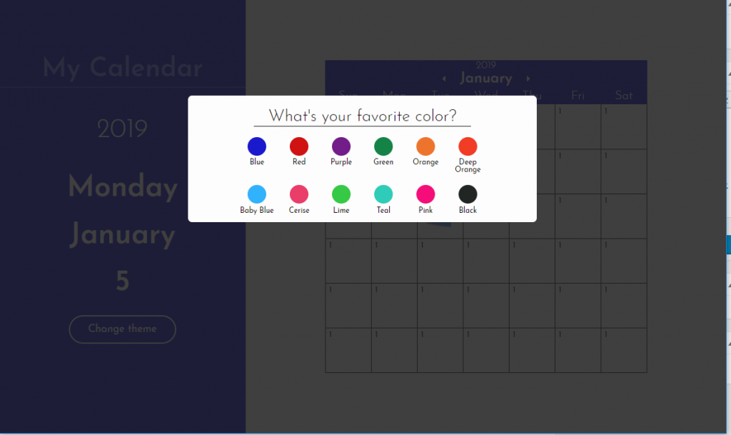
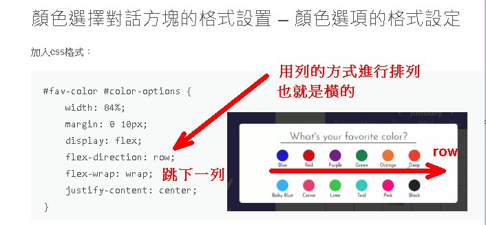
顏色選擇對話方塊的格式設置 – 顏色選項的格式設定
加入css格式:<style media="screen">
.popup {
position: static;
display: flex;
flex-direction: column;
align-items: center;
width: 40vw;
margin: 22vh auto 0;
background-color: #FEFDFD;
border-radius: 20px;
}
#fav-color h4 {
margin: 32px 0 18px;
font-size: calc(12px + 1.6vw);
font-weight: 300;
padding: 0 2vw 2px;
border-bottom: 1px solid #222;
}
#fav-color #color-options {
width: 84%;
margin: 0 10px;
display: flex;
flex-direction: row;
flex-wrap: wrap;
justify-content: center;
}
#fav-color #color-options h5 {
margin: 8px 0 12px;
font-size: calc(6px + 0.6vw);
font-weight: 500;
}
#fav-color #color-options .color-option {
margin: 0.4vw;
width: 4.5vw;
text-align: center;
display: flex;
flex-direction: column;
align-items: center;
}
#fav-color #color-options .color-preview {
width: calc(16px + 1.7vw);
height: calc(16px + 1.7vw);
padding: 0;
border-radius: 100%;
display: flex;
/* 依據交叉軸(縱)置中對齊 */
align-items: center;
/* 依據主軸(橫)置中對齊 */
justify-content: center;
}
</style>
div區塊的排列指定方式 flex, flex-direction:column/row
指定以column排列
指定以row方式進行排列
 加入update按鈕:(放在popup區塊中)
<button id=”update-theme-button” class=”button font”>Update</button>
 目前階段的程式連結
顏色選擇對話方塊的格式設置 – 按鈕格式、按鈕滑鼠滑過反黑、顏色選擇滑鼠經過產生些微透明度
#fav-color #update-theme-button {
    margin: 24px 0 20px;
    padding: 10px 26px;
    font-size: calc(8px + 0.6vw);
    font-weight: 400;
    border: 3px solid #222;
}

#fav-color #update-theme-button:hover {
    color: white;
    background-color: #222;
}
顏色選擇對話方塊的格式設置 – 加上勾選符號
同樣的,到Font Awesome網站尋找勾選符號(英文:Checkmark),複製代碼加到我們的html碼:<div class="color-option">
<div class="color-preview checkmark" id="blue" style="background-color: #1B19CD;"><i class="fas fa-check checkmark"></i></div>
<h5>Blue</h5>
</div>
checkmark的css設定:
#fav-color #color-options .checkmark {
    color: white;
    font-size: 1.2vw;
}
勾選符號的垂直與水平置中對齊是在color-preview這個類別選擇器加上(因為勾選符號是放在color-preview內):
display: flex;
/* 依據交叉軸(縱)置中對齊 */
align-items: center;
/* 依據主軸(橫)置中對齊 */
justify-content: center;
上面並套用先前寫好的checkmark格式:
 目前階段的程式連結
Bonus,使用clip-path製作任意形狀的色塊: https://bennettfeely.com/clippy/
目前階段的程式連結
Bonus,使用clip-path製作任意形狀的色塊: https://bennettfeely.com/clippy/
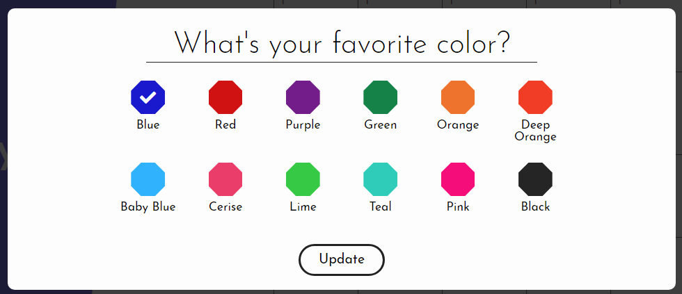 CSS:
CSS:
#fav-color #color-options .color-preview {
  width: calc(16px + 1.7vw);
  height: calc(16px + 1.7vw);
  padding: 0;
  /* border-radius: 100%; */
  clip-path: polygon(30% 0%, 70% 0%, 100% 30%, 100% 70%, 70% 100%, 30% 100%, 0% 70%, 0% 30%);
  display: flex;
  align-items: center;
  justify-content: center;
}
加入記事對話方塊
在加入新的對話方塊之前,我們先將fav-color這個div區塊進行隱藏的設定:<div id="fav-color" hidden>然後,在fav-color區塊後,填入:
<div id="make-note">
  <div class="popup">
    <h4>Add a note to the calendar</h4>
    <textarea id="edit-post-it" class="font" name="post-it" autofocus></textarea>
    <div>
        <button class="button font post-it-button" id="add-post-it">Post It</button>
        <button class="button font post-it-button" id="delete-button">Delete It</button>
    </div>
  </div>
</div>
並進行css設置:
#make-note h4 {
    margin: 32px 0 18px;
    font-size: calc(16px + 1.6vw);
    font-weight: 300;
}

#make-note #edit-post-it {
    height: 340px;
    width: 42vw;
    font-size: 2.6vw;
    padding: 14px;
    border: 1px solid #D8D8D8;
    border-radius: 10px;
    outline: none;
    resize: none;
}

#make-note .post-it-button {
    display: inline;
    margin: 24px 0 20px;
    padding: 10px 26px;
    font-size: calc(12px + 0.6vw);
    font-weight: 400;
}

#make-note #add-post-it {
    border: 3px solid #222;
}

#make-note #add-post-it:hover {
    color: white;
    background-color: #222;
}

#make-note #delete-button {
    border: 3px solid #D71C1F;
    background-color: #D71C1F;
    color: white;
}

#make-note #delete-button:hover {
    background-color: white;
    color: #D71C1F;
}
記事對話方塊畫面:
 目前階段的程式連結
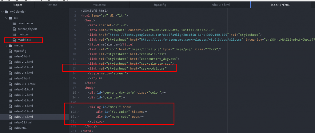
最後,新增一個css/modal.css,並將這個階段的css放入這個modal.css中,並在head加入:
目前階段的程式連結
最後,新增一個css/modal.css,並將這個階段的css放入這個modal.css中,並在head加入:
<link rel="stylesheet" href="css/modal.css">整個程式的樣貌:
 本階段程式
本階段程式