
Part 4 建立具有Responsive特性的App
響應式App/Responsive Web Design App
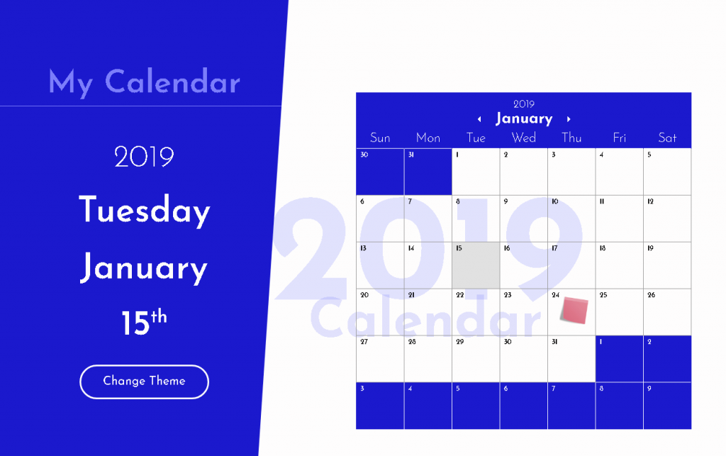
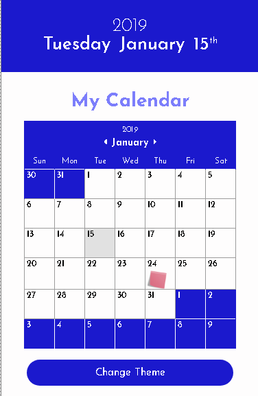
| Landscape模式 | Portrait模式 |
|
|
|
Media query
Landscape V.S. Portrait<!DOCTYPE html>
<html lang="en">
<head>
<meta charset="UTF-8">
<meta name="viewport" content="width=device-width, initial-scale=1.0">
<meta http-equiv="X-UA-Compatible" content="ie=edge">
<title>Document</title>
<style media="screen">
body {
display: flex;
}
#box1 {
background: yellow;
width: 33%;
height: 300px;
}
#box2 {
background: blue;
width: 33%;
height: 300px;
}
#box3 {
background: green;
width: 34%;
height: 500px;
}
@media (orientation: landscape) {
body {
flex-direction: row;
}
}
@media (orientation: portrait) {
body {
flex-direction: column;
}
#box1, #box2, #box3 {
width: 100%;
}
}
</style>
</head>
<body>
<div id="box1">Box 1</div>
<div id="box2">Box 2</div>
<div id="box3">Box 3</div>
</body>
</html>
將上面網頁碼輸入,並儲存testResponsive.html,使用chrome瀏覽器開啟,按<F12>,測試不同裝置下的瀏覽效果。
回到我們逐步完善的月曆App,目前整個格式的設計預設是以Landscape模式進行設計,若是碰到手機型式高度大於寬度的螢幕,也就是我們所熟知的直式/portrait,此時,若沒有進行模式上的對應調整,整個網頁是不好看的。
再者,手機/平板並無滑鼠,在一些行動裝置上,我們先前針對重點提示的hover動作(tooltip),當物件被點擊時,也會觸發hover效果,因此,為了避免此種問題,可將tootltip的hover設定放在landscape模式中:(main.css)
@media (orientation:landscape) {
  .tooltip:hover {
    cursor: help;
    position: relative;
  }

  .tooltip:hover span {
    display: block;
    font-size: 1vw
    padding: 6px;
    white-space: pre-wrap;
    width: 12vw;
    z-index: 100;
    background-color: #EDEDED;
    color: black;
    border-radius: 6px;
    left: 2vw;
    top: 4vw;
    position: absolute;
  }
}
接著,我們做一個簡單的測試:
<style media="screen">
    @media (orientation : portrait) {
        body {
            flex-direction : column;
            background-color : green;
        }
    }
</style>
將上面這段css加入,然後縮放瀏覽器,觀察發生什麼事?
左邊的響應式處理
<style>
    @media (orientation: portrait) {

        body {
            flex-direction: column;
        }

        #current-day-info {
            width: 100%;
            min-height: initial;
            height: 12vh;
            padding: 1vw 0;
            display: flex;
            align-items: center;
            justify-content: center;
            flex-direction: column;
        }

        #current-day-info h2 {
            font-size: 6vw;
        }

        #current-day-info h1 {
            font-size: 7vw;
        }

        #current-day-info #app-name-landscape {
            display: none;
        }

        #current-day-info #theme-landscape {
            display: none;
        }

        #current-day-info .current-day-heading {
            display: inline;
            padding: 0;
            margin: 0 4px;
        }
    }
</style>
目前階段的程式連結
月曆的響應式處理
#calendar {
    width: 100%;
    display: block;
    margin-top: 3.6vh;
}

#calendar #app-name-portrait {
    display: block;
    margin: 0;
    font-size: 3.5vh;
}

#calendar h4 {
    padding: 1.2vw 0 0.2vw;
    font-size: 2.8vw;
}

#calendar h3 {
    font-size: 3.8vw;
    padding: 1.4vw 2vw 0.8vw;
}

#calendar .icon {
    font-size: 2.9vw;
}

#calendar .weekday {
    font-size: 2.5vw;
}

#calendar tbody td {
    height: 9.8vw;
    width: 9.8vw;
    font-size: 1.6vw;
    padding: 0.8vw;
}

#calendar img {
    width: 7.4vw;
    top: 0.7vw;
}

#calendar #theme-portrait {
    display: block;
    padding: 3vw 26.5vw;
    font-size: 4vw;
    margin-top: 2vh;
    border: none;

}
目前階段的程式連結
對話方塊的響應式處理
.popup {
    width: 75vw;
}
#fav-color #color-options .color-option {
    width: 12vw;
}
#fav-color #update-theme-button {
    padding: 6px 16px; border-width: 2px;
}
#fav-color #color-options .checkmark {
    font-size: 1.2vh
}
#make-note #edit-post-it {
    width: 62vw;
    height: 24vh;
    font-size: 4vh;
}
在這個月曆RWD中,我們只簡略地使用橫與直式的版面切分,這樣的切分是不夠細的,大家可以Google “css rwd 斷點” “css rwd breakpoint”,可以找到一些常用的切斷點,像是 Bootstrap。
目前階段的程式連結
最後,將此次響應式的css儲存至portrait.css,並加入linkref指定使用portrait.css。
另外,月曆應用程式中的按鈕 theme-portrait (直式版面時的色彩選擇按鈕) 套用了 button 與 color二個類別選擇器:
<button id="theme-portrait" type="button" name="button" class="font button color">Change Theme</button>在此請特別注意,color一定要出現在button的後面,因為CSS後面的格式設定會蓋掉前面的格式,若button在後面,按鈕的背景色設成透明(融入背景),會導致這個按鈕被背景吃掉(看不到)。
.button{
    border-radius: 500px;
    outline: none;
    margin: 0 auto;
    background-color: Transparent;
}

.color {
    color: #FEFDFD;
    background-color: #1B19CD;
}
延伸閱讀
- CSS Media Queries 介紹與基礎應用
- 回應式網頁設計基礎
- Responsive Web Design (RWD) 響應式網站開發教學與心得
- W3C School HTML Responsive Web Design
- Responsive web design basics
- Responsive Web Design: 50 Examples and Best Practices
- RESPONSIVE WEB DESIGN EXAMPLES
- Google Web 回應式網頁設計基礎
- Responsive Web Design Fundamentals
- 學習 CSS 版面配置 – Flexbox
- A Complete Guide to Flexbox
- 深入解析 CSS Flexbox
- 回應式網頁設計模式
- CSS 定位 (Positioning)
- 關於 “display” 屬性
- CSS 基礎 例子 display屬性:block、inline和inline-block的區別